Author
Kunaal Sharma
The SharePoint App Bar Redesign: A Shift in How Work Actually Happens
Before the SharePoint app bar, there was no out of the box global navigation in SharePoint Online. Every site operated with its own navigation and often there was confusion on where you could go or what you could access. If you needed to move across your intranet, you had to:
- know which site you were looking for
- remember how to get there
- rely on bookmarks or quick links
- or build a custom navigation solution
For a lot of organizations we worked with, this became a problem. As more sites were created, the experience became harder to navigate, not because the content wasn’t there, but because there was no consistent way to move between it. The app bar was Microsoft’s solution. It introduced a persistent left-hand navigation with a single place to access:
- Global navigation (when configured)
- Sites
- Files
- News
At the time, this worked. It gave SharePoint something it was missing: a reliable way to get around. But this came with a limitation. The app bar helped you move between things. It didn’t help you decide what to do next.
This is what Microsoft is trying to accomplish with the new SharePoint App bar experience.
While this may look like just an interface refresh, it is a bigger shift than that. It’s moving SharePoint away from a model that assumes people understand structure and toward one that tries to guide them with intent. It’s no longer asking people to figure out where to go first. It’s looking to help them do the thing they came to do.
Why this redesign matters
The easiest way to understand the redesign is to compare the old mental model with the new one.
The old SharePoint experience was organized around content types and containers: Sites. News. Files. Libraries. If you were comfortable with SharePoint, that probably felt normal. If you were anybody else, it meant doing extra mental work before you could even start.
The new app bar shifts that experience toward clearer destinations: Discover for finding relevant content, Publish for creating and managing communications, Build for creating and managing sites and components, OneDrive for navigating personal files, and Home when global navigation is enabled through a configured Home site.
This is not just better labeling, but it’s better framing.
People rarely start the day thinking, ‘I need to interact with a file type.’ They think, ‘I need to find something,’ ‘I need to post an update,’ or ‘I need to spin up a new workspace.’ This redesign helps close the gap between how the system is organized and how people actually work.
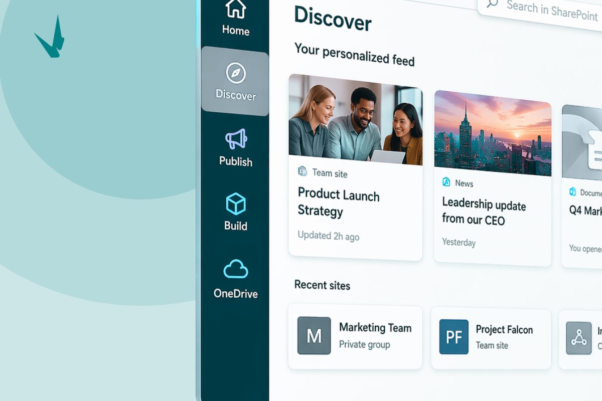
Discover
If there is one part of the redesign that will change the daily experience most, it is Discover.
Discover replaces the older SharePoint start experience with something more dynamic and personalized. Instead of beginning with a static sense of ‘here are your sites,’ SharePoint now tries to surface the sites, content, and news that are most relevant to your work.
For the average employee, the biggest frustration is not usually a missing feature. It is wasted effort: Clicking through a few sites to find the file someone mentioned yesterday. Going back to a bookmarked page because you can’t remember which hub it belongs to. Searching for a news post you know you read last week but can’t place.
Discover is designed to reduce that wasted effort by making relevant activity and content easier to surface up front. But a feed-driven experience only feels smart if the content underneath it is well structured. If your metadata is inconsistent, your ownership model is fuzzy, your site architecture is messy, or your pages are poorly connected, Discover does not solve those problems. It reflects them.
That’s our first big takeaway from the redesign: the UI got simpler, but the system behind it matters more than ever.


Image from Microsoft
Publish
The second major shift is Publish, and this is the one internal communications teams should care about most.
Historically, publishing in SharePoint has been tied to place. If you wanted to create a news post or page, you typically had to navigate to the right site, find the right button, and create from there.
The new experience changes that by giving users a dedicated Publish destination in the app bar, where content creation and management are brought together more intentionally.
From a workflow perspective, that is a smart move. It acknowledges a simple truth: content creators do not think in site hierarchy first. They think in deadlines, messages, audiences, approvals, and outcomes. But Publish also introduces a quieter risk. The easier it becomes to start creating content from anywhere, the easier it becomes for organizations to lose clarity about where content belongs, who owns it, and how it should be governed.
Publish lowers the friction to act, which is good for productivity. It also raises the cost of weak governance, because content can be created more quickly than it can be organized.
Publish improves the act of creating content. It does not automatically improve the discipline behind it.


Image from Microsoft
Build
The addition of Build in the app bar makes site creation, content structures, and solution-building feel like first-class actions rather than hidden admin tasks.
From an experience perspective, this is a good call. One of the more frustrating aspects of SharePoint behavior was how creation often depended on knowing the right path first.
Build helps reduce that dependency by surfacing creation and management more directly. That makes the system feel less buried and more usable, especially for site owners and teams managing their own collaboration spaces.
Still, making creation easier does not solve sprawl. Centralizing tools does not create governance. If anything, Build increases the need for a clear operating model because it makes SharePoint’s building power more visible and accessible.


Image from Microsoft
What organizations should do before rollout finishes
While showing people where the new buttons are, it will be just as important to make sure your environment behind those buttons is setup properly.
If you are responsible for SharePoint, internal communications, or intranet design, now is the time to review:
- How content is tagged and classified
- Whether site ownership is clearly defined
- Whether publishing rules are documented
- Whether your Home site and global navigation are configured properly
- Whether your architecture supports discovery rather than just storage
And if Copilot is part of your future roadmap, this becomes even more urgent. AI experiences in SharePoint depend on the quality of the environment they are pulling from. Better structure produces better responses from Copilot. Messier structure produces noisier results

The SharePoint app bar redesign is not important because it looks different. It is important because it reflects a deeper change in how Microsoft wants SharePoint to be used. Less as a place people navigate manually. More as a system that helps people find, create, and build.
While these good updates, a simpler interface does not eliminate the need for better information architecture. It makes better information architecture more visible. A faster publishing experience does not solve governance. It makes governance more urgent. And a more intelligent SharePoint experience does not make structure irrelevant. It makes structure the thing everything else depends on.
If you’ve been looking for a practical reason to review your intranet design, this is it. Not because SharePoint changed its menu. Because SharePoint just changed what good design now needs to support.