Author
Noorez Khamis

The demand for website creation is exponential. As part of Microsoft’s commitment to democratizing development with low-code tools, Microsoft Power Pages promises that you can “do more with less by enabling all your teams—not just developers—to create professional websites—so you get to market faster at lower cost. As the current digital landscape grows in size and sophistication, user experience (UX) and user interface are becoming more than just buzzwords—they are pillars of successful web-based content. Without good UI/UX, any website or product is destined to fail. Even the most well-conceived initiatives are bound to face challenges and fall short of their goals if UI/UX is an afterthought.
Essentially, UX is the map that charts the course between digital triumph and obscurity. The question remains: How can burgeoning designers juggle UX and other design considerations effectively? Microsoft’s commitment to low-code solutions helps level the playing field, making design and development more accessible. That’s where Microsoft Power Pages comes in, giving anyone the tools they need to quickly create professional, functional sites that put users first without coding experience. Let’s delve into the crucial best practices that ensure a functionally and aesthetically competent product that gives users an informative, engaging, and positive experience.
Do your research… lots of it
Before commencing any web design project, the first thing to do is conduct as much research as possible about who your site is for and why they would visit it. Conducting effective research before starting your project sets up clear expectations of outcomes, ensures that your audience is always at the forefront of your mind, and gives you insight into how competition will impact your project.
Know your users!
The entire purpose of a successful business website is to effectively serve its users in achieving their goals. Your project also reflects on the character of your business in your users’ eyes, so ensuring that your site meets their needs is key! Knowing your users goes beyond analyzing demographic statistics from analytics apps; it means you also understand their needs, goals, and what’s hindering them from achieving them. A site built from empathy with its users is far more likely to succeed than one built only from user statistics.
Content is key, let the aesthetics follow
While visual aesthetics are crucial to a design product’s success (and we’ll get into this later), they serve little purpose if the content of your site doesn’t meet your user’s expectations. It’s best practice to map and draft any copy before adding visual flair. Ensuring your content is informative, clear, engaging, and relevant to your users and their plight is critical; users are looking for practical solutions, not compensatory aesthetics. However, that is not to dismiss visual aesthetics as unnecessary, as they play a significant role in helping users and keeping them engaged. The aesthetics should complement the content, guiding the user’s attention to important information, promoting the project’s message, and contributing to a positive user experience. It’s also important to maintain a balance between content and visuals, as you risk either overwhelming users with too many flashy colours and graphics or boring them with too little visual stimulation.
Stick to the principles of visual design:
Appearance is the first thing a user will notice when interacting with a design, so it makes sense that you put effort into this aspect of your site. Every website has crucial aesthetic aspects you should consider to create a visually appealing design and engaging user experience, so let’s dive in.

Contrast
In web design, contrast refers to differentiating visual elements to draw users’ attention to important information and actions. Contrast can easily make or break a design. Many factors, such as colors, sizing, and spacing, must be considered.
Readability
In any web design project, readability is a crucial component of UX. If your content is too difficult to read or understand, how are users going to benefit from your product? A design’s readability starts with typography; fonts should be legible and easy on the eyes. The text should also contrast heavily with its background so it stands out. The line length should also allow users to scan information without moving their eyes too much or too little to reduce annoyance or boredom respectively.
Visual Hierarchy
Visual hierarchy relates heavily to the other design principles we’ve covered, as it refers to how the layout and composition of a design’s elements guide the user’s eye from what’s most important to what’s least important. Successful designs have a clear path that users follow, with crucial information and actions catching attention first through either being chromatically, spatially, or dimensionally distinct. Most important information will also be denoted with a larger or bolder typeface.
Consistency
Consistency is instrumental in design—from its colors, fonts, font sizes, button sizes, button types, content organization, animations, etc. A design should tell a cohesive story that keeps users interested and engaged; if the site is inconsistent, so is your story, which can be frustrating. A great way to ensure consistency is to create a UI design kit, which we will dive into later.
Keep users engaged and informed through comprehensive visual feedback
In the real world, we receive environmental feedback for every action we take. We need feedback to orient ourselves, or we’d be hopelessly lost. This notion extends to website creation, as users need instant feedback whenever they interact with a design, or they’ll be confused about the next steps, question the quality of the design, and stop using it altogether. Providing users with effective feedback guides them through an engaging journey, minimizes confusion, enhances user confidence, and contributes to a positive overall user experience. There are many ways to implement feedback into your project that makers of all skill levels can create:
Visual indicators for actions
This is the most common form of feedback that projects give you, just providing a little change to an element that a user interacts with to let them know their action is acknowledged. These changes can include a button changing color or an animation playing when a process is underway (like a loading spinner), giving users confidence that they are making progress. A search results page is a great example; clicking a result changes color from blue to purple. Simple, yet effective; part of the reason it’s stuck around for so long.
Real-time validation
If your site has users filling out forms or providing data, it’s helpful to give them validation so that they know they’re doing it right, minimizing room for mistakes. This validation can come in the form of a short message/animation indicating if a field was inputted correctly or not or a message indicating if an email address/username is already taken.
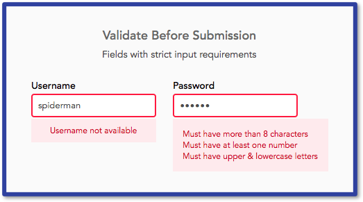
Error Feedback
It’s inevitable for something to go wrong, and the only thing designers can do is mitigate confusion when things go south. Error messages are great for communicating to a user that something went wrong, as it lets them know that the site is prepared to help get them back on track. No matter what type of error it is for, an effective error message should communicate the following:
- What caused the error
- What the user can do to fix it, along with suggestions (if applicable)
- What will happen if the error is not fixed
It’s best to communicate all of the above in layperson’s terms and in no more than two sentences so users can grasp it at a glance. The message should also have a polite, positive tone to it, as users are more likely to respond positively to a respectful, helpful message.
Stay aware of usability heuristics
Back in the distant year of 1994, Jakob Nielsen, known as the king of usability, introduced 10 key interaction design principles, or as he dubbed them, “heuristics.” Every designer should follow these broad rules of thumb to ensure a top-of-the-line user experience. Some of the most crucial ones include using familiar and natural language to not confuse the user, giving users a quick way out an action if they make a mistake, following industry conventions to meet user expectations, making all options visible to not overload user’s memory, and keeping design minimalist and simplistic, as the content and visuals of the UI should only focus on the essentials.
Stop using the defaults!
The main reason to avoid using Power Pages templates is that they don’t provide as unique an experience. The first action you can take to revamp the default is to adjust the colors to better align with your brand standard instead of using the standard colors from the color picker. The same goes for the font. Typically, open sans is the default font, but there are many options to choose from. Even then, you’re not limited to the fonts listed—you can insert any font you need from any source, as long as it’s web-safe and will update automatically in Power Pages’ design suite.

Make use of a design checklist
Testing your page against a set of guidelines is never bad practice, as it ensures you cover all the essential success criteria. Microsoft’s app design checklist is a great place to start, as its guidelines can apply to any design project. This checklist has performative, visual, and informational success criteria that any designer can review to see if their Power Pages project is up to snuff.
Create a UI design kit to prepare for the future
Design projects don’t end when the final product is delivered, as there will be issues that designers will need to address regularly, such as implementing user insights, keeping the site updated with current information, overhauling visuals, and adding features to reflect brand changes or growth. To account for this, designers need a guide to review to ensure the site remains consistent throughout its updates. An effective kit will have all the important design specifications for the project: fonts, buttons, color palette, etc. Creating a kit requires effort, but it is more than worth it in the long run, as it saves time and energy for you and any other designer working on your product in the future.
To conclude
Mastering UI and UX in Power Pages requires a strategic blend of empathy for your users and creativity. At the end of the day, it’s all about crafting a seamless, engaging journey that leaves users with a sense of satisfaction. Now that you have an idea of the most crucial best practices for enhancing user experience, you can start transforming web pages into immersive, valuable experiences using the immense potential of the Power Platform. Applying these practices allows you to elevate your web projects to interactive solutions that capture, inform, and empower.


