Author
ali.razmi
In today’s ever-evolving digital landscape, user interface (UI) and user experience (UX) have become the cornerstones of successful software applications. Whether you’re a seasoned designer or just dipping your toes into the world of UI/UX, one thing is clear: crafting exceptional experiences is a non-negotiable requirement.
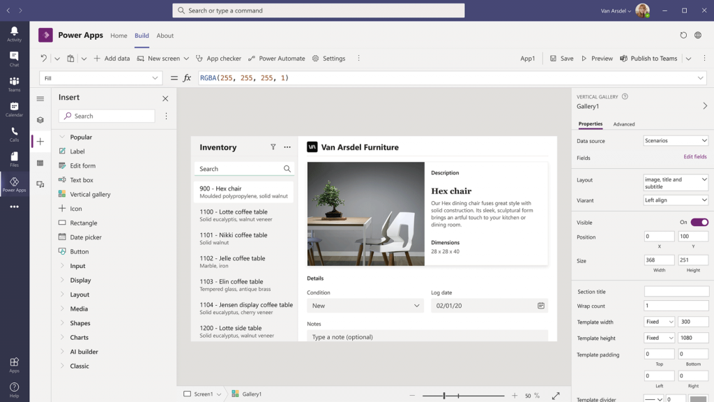
Enter Power Apps, a dynamic platform empowering designers and developers to build custom apps without the need for extensive coding skills. Whether you’re aiming to streamline business processes, enhance customer interactions, or create engaging internal tools, mastering the UI/UX of Power Apps can be a game-changer.
Let’s dive into 10 design best practices and actionable tips that can elevate your Power Apps’ UI/UX from good to exceptional, emphasizing functionality and aesthetics ensuring that every user interaction is a seamless and delightful journey. Wherever you are in your design journey, we’ve got a tip for you—from beginner to intermediate Power App tips, learn how to refine and strengthen your design skills.
Effortlessly elevate your Power App designs with these 5 basic concepts that are important to master to create clean and professional designs.
1. Balance
When designing, it’s important to create a sense of balance and alignment. This occurs when there is an equally distributed amount of visual signal on both sides of the imaginary axis. Grids are especially helpful to ensure that you create a balanced interface.
2. Scale
Create importance and hierarchy in your designs by leveraging scale. Change the size of certain elements to highlight what you want your users to see first. You can easily send signals of importance and rank in composition to your users through relative size. You should base the scale on the different layers of actions you want your users to perform on a given screen.
3. Contrast
Another principle that is important to master is contrast. This refers to juxtaposing different visually dissimilar elements to convey their differences. This can be through color or size.
4. Visual hierarchy
Visual hierarchy refers to guiding the eye on a page to attend to design elements in the order of importance. There should be a clear path for users to follow that they should naturally be drawn to on the screen; this is about functionality > aesthetics. Even the most beautiful interface in the world doesn’t mean anything if its users don’t use it. Defining a clear visual hierarchy should be prioritized heavily.
5. Gestalt principle
As humans, our minds are smart enough that they don’t require a full element to understand what something should look like—we can fill it in ourselves. The Gestalt principle describes how humans perceive and organize visual information in meaningful ways and captures this tendency to perceive the whole picture instead of individual elements. It helps to explain how our brains naturally group elements together to form a unified and coherent perception of the entire picture.

5 intermediate-level Power App design tips with best practices
6. Be aware of Usability Heuristics
Jakob Nielsen teaches ten general principles for interaction design, which he refers to as “heuristics.” These heuristics are essential to note as broad rules of thumb and not specific usability guidelines. Key principles include clear system status updates, familiar language, user control, consistency, error prevention, visible options, flexibility, minimalist design, effective error handling, and helpful documentation. Implementing these heuristics ensures intuitive, efficient, and error-resilient designs for enhanced user experiences.
7. Make use of an app design best practices checklist.
Using a set of guidelines to evaluate your app design ensures you cover all the essential success criteria. Microsoft provides a fantastic resource with 10 artifacts for you to base your evaluation on; they vary from performance to color accessibility. Click the link below to access the recommended success criteria for each component.
8. Ensure that you consider all aspects of UI/UX
“User Experience” encompasses all aspects of the end-user’s interaction with the company, its services, and its products.
– Don Norman, of the Nielsen Norman Group
Your users should be the center of your designs, but putting this principle into action involves considering factors beyond just your users. As valuable as they are, it’s important to look at your company’s brand, the competitive landscape, your unique value proposition, user stories, testers, and subject matter experts to get a full view of the user experience.
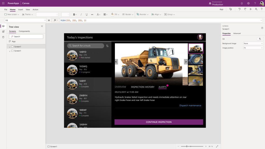
9. Stop using the defaults
The 2 main reasons to stop using the Power App templates are that it’s a dead giveaway, that your app is a Power App, and it doesn’t provide the best aesthetic experience. The first action you can take to revamp the default is to adjust the colors to better align with your brand standard instead of using the standard colors from the color picker. The same goes with font; open sans is the default font, but many other options are provided. Even then, you’re not limited to the fonts listed; as long as you have a web-safe font, you can insert any font you need, and it will update automatically.
10. Choosing the right app-building methodology
When beginning to create your design, it’s important to consider the 2 main app-building approaches you can take.
The first approach is all about “data first.” Here, you want to focus on the data and logic layer of the application while saving the look and feel of the user experience for last.
The second approach is about “design first” and putting a focus on getting all the design elements taken care of as your main priority. Gathering brand standard information (logos, typography, color codes, etc.) and considering the overall flow of the app (what controls should be there, how they should look, how many clicks, etc.) is what would be completed first.
There is no right or wrong approach, and the direction you take will vary by the circumstances and needs of your users. You might use the “design first” approach because of customers’ visual nature and the desire to see progress fast.
In closing
So, there you have it! 10 design best practices and tips to help improve the UI/UX of your Power App designs.
The role of designers in enhancing UI/UX has never been more crucial. With its immense potential for customization and innovation, Power Apps provides a canvas for designers to unleash their creativity and craft unique applications. By incorporating the 10 practical tips we’ve explored in this article, you have the tools to elevate your Power Apps’ UI/UX game. Remember, UI/UX design is a continuous process of learning and refining. Stay curious, gather feedback, and iterate based on user insights.
So, go ahead, apply these insights, and let your Power Apps shine with a new level of visual elegance, intuitive usability, and seamless interactions. Whether you are learning the basics or enhancing your skillset, may your designs be the driving force behind transformative digital experiences that leave a lasting impression.


